Wednesday, 16 October 2013
Dry point technique
For this technique, I used tracing paper to draw a design. I then transferred the design to card by using a crafting knife and carving into the design over card. After I used ink paints and 'dabbed' it into the lines on the card, I then laced the card face down on to damp paper and placed it on to a flattening machine. This then caused the image to transfer on to the paper.

Life Drawings
In our drawing classes, we have been drawing things from life, for my drawings I drew a model who stood in the middle of the room.
This drawing was made using black paper and coloured pastels,. It was made using a continuos line, where we wasn't allowed to remove the pastel from the paper. My favourite of the three is the last one as it has better shaping. I would improve the way I drew the models posture.

These were made using a graphite pencil. It was easy to use so it didn't take long to produce my work. I think that the first picture looks more elegant than the second. It also expresses an expression of sadness because of the models posture.

These were made using inks. The first and last are line drawings, with sharp angles, where as the second is softer and has squiggly lines. The fast one was made at a fast pace. I think that the lines communicate the feeling of sadness and loneliness because of the colours and the positioning. I would improve these by adding more depth and shading.

This piece was done with two coloured pens tied together. It gives a double image effect and it changes the way you see the shapes.

This is a collaboration picture. It was done by many people, I started it off by drawing specific shapes in various sizes, then the work was swapped around between other people and they added their own shapes and colours. I think that the outcome looks really good and unique.

This drawing was done with coloured pens, it was focused on 'shape', using a model in the middle with statues placed around her. The paper was a normal white sheet, which gives the colours a bigger effect.

This drawing was made using black paper and coloured pastels,. It was made using a continuos line, where we wasn't allowed to remove the pastel from the paper. My favourite of the three is the last one as it has better shaping. I would improve the way I drew the models posture.
These were made using a graphite pencil. It was easy to use so it didn't take long to produce my work. I think that the first picture looks more elegant than the second. It also expresses an expression of sadness because of the models posture.
These were made using inks. The first and last are line drawings, with sharp angles, where as the second is softer and has squiggly lines. The fast one was made at a fast pace. I think that the lines communicate the feeling of sadness and loneliness because of the colours and the positioning. I would improve these by adding more depth and shading.
This piece was done with two coloured pens tied together. It gives a double image effect and it changes the way you see the shapes.
This is a collaboration picture. It was done by many people, I started it off by drawing specific shapes in various sizes, then the work was swapped around between other people and they added their own shapes and colours. I think that the outcome looks really good and unique.
This drawing was done with coloured pens, it was focused on 'shape', using a model in the middle with statues placed around her. The paper was a normal white sheet, which gives the colours a bigger effect.
Essay
The two artists I have chosen for my essay are Amelie Hegardt and David Downton as they are both artists I have been working on in my project over the last few weeks. They are also the two artists that have inspired my work as I find both of their work interesting and unique.
My first artist is Amelie Hegardt, she has studied at Art History at Stockholm University. She is now based in London but tends to work in Stockholm. She is known for being a fashion illustrator and artist, and she also designs wallpapers and pillow cases. Amelie creates her work using materials such as; inks, watercolours, pastels and gouache. Her illustrations are mainly focused on fashion women, including 1920's silhouettes with blushing cheeks, she also uses bleeding inks with luminous colours which have a beautiful effect. Amelie became successful in 2006, when she won a 'Blackbook' magazine competition, winning her six pages for her illustrations.


My second artist David Downton, studied illustrations/graphics at Canterbury in 1977 and then at Wolverhampton in 1981. David started his illustration career in 1984 when he moved to Brighton. He became successful in fashion illustrations in 1996, when he was asked to draw the Paris Couture shows by The Financial Times. The materials he uses vary from inks to pastels and unlike Amelie, he uses quite darker colours on his illustrations. Downton has had many influences through out his time and some of them are well known women of today, including Lily Cole and Twiggy. That is why he has also became successful for doing portraits.


The two artists work styles are similar in the way that they both do beautiful ink illustrations of elegant fashion silhouettes. Another things is the texture of their work and the way they make the inks bleed together around the illustration is very effective and leaves a beautiful effect. They also use a variation of colours when it comes to making small details to create effects, such as shading.
However, both artists work differ from each other's for many reasons. The first is that although they both do fashion illustrations, Amelie's a more focused on silhouettes and are inspired by fashion eras such as the 1920's, where as David works more on portraits and with well know models. Another difference between the two is that Amelie uses bright, luminous colours with her inks and watercolours, to make her work more feminine, and David uses darker and bolder colours as it makes his work look more serious and edgier.
In conclusion, I have learnt a lot about these two artists and their style of works. And I didn't know that fashion illustrations were very popular. Their style with the inks and watercolours have really inspired me with my own work, as the ways they make the inks bleed around the illustration is really unique and gives a beautiful effect but still manages to look simple. It also influenced the way I have on my project with my own drawings and illustrations.
My first artist is Amelie Hegardt, she has studied at Art History at Stockholm University. She is now based in London but tends to work in Stockholm. She is known for being a fashion illustrator and artist, and she also designs wallpapers and pillow cases. Amelie creates her work using materials such as; inks, watercolours, pastels and gouache. Her illustrations are mainly focused on fashion women, including 1920's silhouettes with blushing cheeks, she also uses bleeding inks with luminous colours which have a beautiful effect. Amelie became successful in 2006, when she won a 'Blackbook' magazine competition, winning her six pages for her illustrations.

My second artist David Downton, studied illustrations/graphics at Canterbury in 1977 and then at Wolverhampton in 1981. David started his illustration career in 1984 when he moved to Brighton. He became successful in fashion illustrations in 1996, when he was asked to draw the Paris Couture shows by The Financial Times. The materials he uses vary from inks to pastels and unlike Amelie, he uses quite darker colours on his illustrations. Downton has had many influences through out his time and some of them are well known women of today, including Lily Cole and Twiggy. That is why he has also became successful for doing portraits.
The two artists work styles are similar in the way that they both do beautiful ink illustrations of elegant fashion silhouettes. Another things is the texture of their work and the way they make the inks bleed together around the illustration is very effective and leaves a beautiful effect. They also use a variation of colours when it comes to making small details to create effects, such as shading.
However, both artists work differ from each other's for many reasons. The first is that although they both do fashion illustrations, Amelie's a more focused on silhouettes and are inspired by fashion eras such as the 1920's, where as David works more on portraits and with well know models. Another difference between the two is that Amelie uses bright, luminous colours with her inks and watercolours, to make her work more feminine, and David uses darker and bolder colours as it makes his work look more serious and edgier.
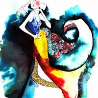 |
| Amelie Hegardt |
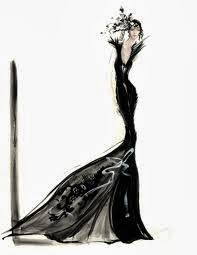 |
| David Downton |
In conclusion, I have learnt a lot about these two artists and their style of works. And I didn't know that fashion illustrations were very popular. Their style with the inks and watercolours have really inspired me with my own work, as the ways they make the inks bleed around the illustration is really unique and gives a beautiful effect but still manages to look simple. It also influenced the way I have on my project with my own drawings and illustrations.
Wednesday, 9 October 2013
Marc Jacobs
Marc Jacobs is a contemporary designer who is the head of Marc by Marc Jacobs and The Marc Jacobs Collection and Little Marc, here he explains his clothes; "Even if someone feels hedonistic, they don't look it. Curiosity about sex is much more important to me than domination....My clothes are not hot. Never, never."


His clothes have effected the fashion industry in many way, starting with his grunge theme in 1993, to chic and vintage accessories, he loves to match his bold, quirky accessories with his traditional designs and clean cut silhouettes.
Vivienne Westwood on Wogan & Jonathan Ross
When Vivienne Westwood appeared on the Wogan show in the 1988, the host Sue Lawley and other guest Russell Harty encouraged the audience to diss and laugh at Vivienne's designs, with Vivienne threatening to stop the models from coming out unless the audience stopped laughing. It was until other guest Janet Street-Porter, who had just become head of youth entertainment by the BBC, stuck up and defended Vivienne by saying everyones being unfair and that Westwood id the most influential designer in England.
Then in 2009, Westwod appeared on the Jonathan Ross show, and from the start of them introducing her, they treated her with so much respect.


Then in 2009, Westwod appeared on the Jonathan Ross show, and from the start of them introducing her, they treated her with so much respect.
Monday, 7 October 2013
Trend Recipe
To make your trend a success,
you need special ingredients including;
50% people using your trend,
20% of social media (twitter/tumblr/facebook),
10% of photography,
10% of magazine influences,
10% of adverts.
The style I’m going to make
trendy is tie dye/printed tees. I think it’s a wicked trend as its aimed at my
own generation and it can be styled in so many ways. There are hundreds of
different types of printed tees and tie dye tops, but what’s really cool is
that with the tie dye tees people can choose to be really different and tie dye
their own tees with their own colours.
To make my style become a
trend, I will use the influence of social media for getting my trend out there.
I can tweet about the trend and blog pictures of it on tumblr, I can also use
hash tags, which is a fast way for finding new things. Also by wearing my trend
around and about, people will notice it and it will influence them to start
wearing the same trend.
The trend will become
fashionable once its gone mainstream and many people are wearing the trend at
the same time. Shops will pick up on the latest trends and will sell many forms
of it to make money.
What makes a style popular is
when many people are wearing that trend and its gone mainstream everywhere.
Monday, 30 September 2013
Current trends
Pastel hair colours are very popular amongst young people, I think that its a really cool trend as a lot of people are experimenting with it and theres no wrong or right way to do it.


Big prints and patterns are also a big trend with young people, it adds something different to the outfit and can make the individual stand out. The prints can be anything from tie dye to big logos.
Subscribe to:
Posts (Atom)