The two artists I have chosen for my essay are Amelie Hegardt and David Downton as they are both artists I have been working on in my project over the last few weeks. They are also the two artists that have inspired my work as I find both of their work interesting and unique.
My first artist is Amelie Hegardt, she has studied at Art History at Stockholm University. She is now based in London but tends to work in Stockholm. She is known for being a fashion illustrator and artist, and she also designs wallpapers and pillow cases. Amelie creates her work using materials such as; inks, watercolours, pastels and gouache. Her illustrations are mainly focused on fashion women, including 1920's silhouettes with blushing cheeks, she also uses bleeding inks with luminous colours which have a beautiful effect. Amelie became successful in 2006, when she won a 'Blackbook' magazine competition, winning her six pages for her illustrations.


My second artist David Downton, studied illustrations/graphics at Canterbury in 1977 and then at Wolverhampton in 1981. David started his illustration career in 1984 when he moved to Brighton. He became successful in fashion illustrations in 1996, when he was asked to draw the Paris Couture shows by The Financial Times. The materials he uses vary from inks to pastels and unlike Amelie, he uses quite darker colours on his illustrations. Downton has had many influences through out his time and some of them are well known women of today, including Lily Cole and Twiggy. That is why he has also became successful for doing portraits.


The two artists work styles are similar in the way that they both do beautiful ink illustrations of elegant fashion silhouettes. Another things is the texture of their work and the way they make the inks bleed together around the illustration is very effective and leaves a beautiful effect. They also use a variation of colours when it comes to making small details to create effects, such as shading.
However, both artists work differ from each other's for many reasons. The first is that although they both do fashion illustrations, Amelie's a more focused on silhouettes and are inspired by fashion eras such as the 1920's, where as David works more on portraits and with well know models. Another difference between the two is that Amelie uses bright, luminous colours with her inks and watercolours, to make her work more feminine, and David uses darker and bolder colours as it makes his work look more serious and edgier.
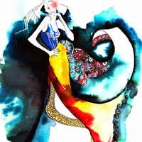 |
| Amelie Hegardt |
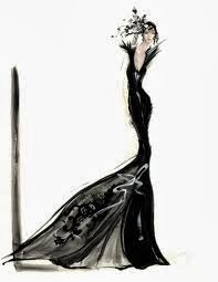 |
| David Downton |
In conclusion, I have learnt a lot about these two artists and their style of works. And I didn't know that fashion illustrations were very popular. Their style with the inks and watercolours have really inspired me with my own work, as the ways they make the inks bleed around the illustration is really unique and gives a beautiful effect but still manages to look simple. It also influenced the way I have on my project with my own drawings and illustrations.


